OS X Ivericks
Syndication
This post was orignally posted on Tumblr on the blog: Nerd Ramblings. View the full syndicated blog or view the original post.
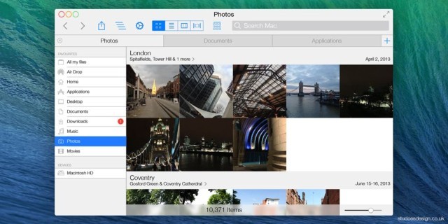
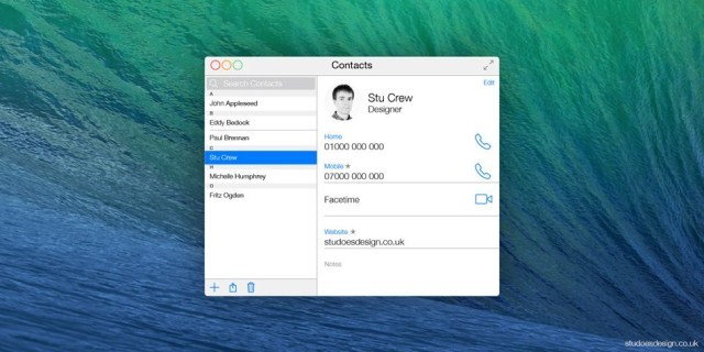
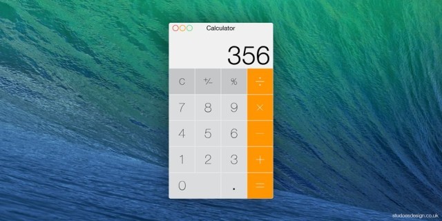
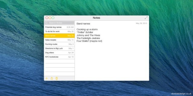
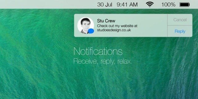
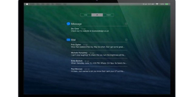
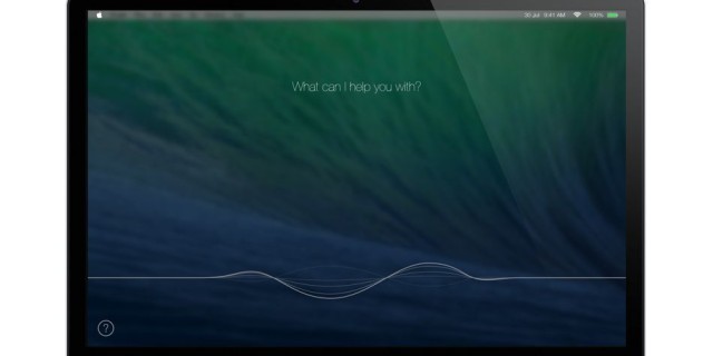
You’ve probably already seen these OS X “Ivericks” mockups around the web the last few days. But to be honest, it scares me a bit. Cause this mockup by _Stu Crew _follow all the iOS & guidelines and are a real look into what an iOS 7 inspired OS X will look like. And I dont think I like the change. I started off as a great fan of iOS 7 when it first got announced. I was in the camp that thought iOS needed a great design overhaul and needed to change to stay competitive. When iOS 7 came around I was happy with it, I loved the new design. But after using iOS 7, the design language just doesn’t add up for me. It feels nowhere near as polished and cohesive as iOS 6. Yes, its still in beta and of course its not polished. But in the 5 beta updates, it has not changed dramatically. It just does not feel right, its hard to explain.
In the next generation of OS X after Mavericks, I imagine much of the iOS 7 design language will be incorporated, in a manner very similar to the mock ups above. And I dont think its going to work. It will different and new and fresh, but after the novelty of that has worn off. The ‘brushed aluminum’ we have come accustomed to will be gone. Which is a pity, cause OS X is beautiful. All the apps follow the OS X design language to a tea, and it looks great and feels great and is so cohesive and works so well. I dont want to lose that. How ugly is it going to look when apps are transitioning to the new look and you have ‘brushed aluminum’ mixed in with modern white space.
Im concerned, I still have faith for iOS 7 and I think it works on the iPhone, but I dont think it works so much on the desktop.
