Competiton Research
Unlike most of the projects I have started this year, this one has already been done. Someone has already designed and brought to market (albeit limited) eyewear that is designed from typography.
I first stumbled upon these many years ago probably in 2012 or 2011, and I remember it clearly because I was devastated. There is nothing more crushing than discovering that something thought you came up with in an original and unique way has actually been done before. I'm sure everyone has felt this in some way or another, it is frequent in creative fields, but I also experienced it a lot while completing my degree in mathematics — most of the times it had been done centuries before you were even born.
TYPE.GS
The collection called TYPE by Japanese eyewear company Oh My Glasses — which is an amazing name for a company — and are for sale only in Japan.
They have some pretty cool marketing.
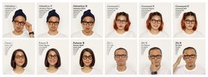
The collection covers 14 different typefaces and hits most pet favourites including: Helvetica, Futura, Garamond, Din, Times New Roman, and others. They retail for 27,000 JPY which equates to around $300-350 AUD, which is about what you would pay for designer eyewear.
Why are you doing it then?
It can sometimes easy to feel that just because someone has already done the thing you want to do that it is not longer a virgin idea and therefore no longer worth your time. And well this is how I have felt for many years now, I've been waiting for them to open up to international delivery so I could get a pair. The glasses are something I want first, and something I want to design second. If I could get a pair the urge for me to do the project would have subsided somewhat. But if I can't buy it, well then I might as well make it.
Secondarily, I think I could do a better job at the design. The designs to me look somewhat pedestrian, I would struggle to identify many of them to their derivative fonts without cheating. I don't think they did a really good job at capturing the character of each typeface and converting that to a piece of eyewear.
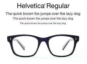
This is Helvetica Regular, perhaps the most recognised typefaces in the world — one that comes with a cult following — yet I don't see any of its iconic curves in the glasses. The stroke widths and the relationships between the thick and thin parts bear no resemblance to the regular and idealised glyphs of Helvetica. Two of the most iconic shapes of Helvetica, the leg of the uppercase "R" and the counter of the lowercase "a", the whitespace in the hole are no where to be found. I'm not sure of the two dots on either side, not quite sure how they tie into the rest of the design.

Some are better than others however. The Din design does slightly better, but still is more like a standard modern piece of eyewear than it is an "inspired by" piece.
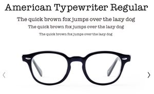
A monospace serif typeface like American Typewriter to me seems like the perfect starting point for a piece of eyewear, but again we have a pretty stock-standard and uneventful design. The unique serifs so characteristic of American Typewriter are no where, the closet we get is the nose arch resembles them almost.
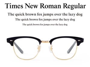
Perhaps the most disappointing design is the one based on Times New Roman. The default font for Microsoft Word for years and years and in return it gets a Clubmaster clone. It feels like they ran out of eyewear shapes and needed to have a Clubmaster clone in there somewhere and Times New Roman got drew the short stick. The contrasting thick and thin strokes of Times New Roman that gives it the distinctive and iconic look are wasted on a gold chrome finish. It could be better.
Can I do better?
Believe it or not these are the only real commercial versions of this idea — at least that I can find. I believe there is a market for this outside of Japan and particularly in Australia, but also America and Europe. I want to create a character profile for each font I design for and make sure the most characteristic and iconic shapes are reproduced in the eyewear. I think stroke is going to be the most important aspect, glasses are a fixed form designed for a human face, there is only so much you can change and stroke is the most prominent. It is all well and good for be to critique this product that has actually made it to market and has been on sale for years, and another for me to actually do something better. Wish me luck.
- ← Previous
June: Is that a font I see? - Next →
July: Famous Last Lies